> ## Documentation Index
> Fetch the complete documentation index at: https://docs.attio.com/llms.txt
> Use this file to discover all available pages before exploring further.
#
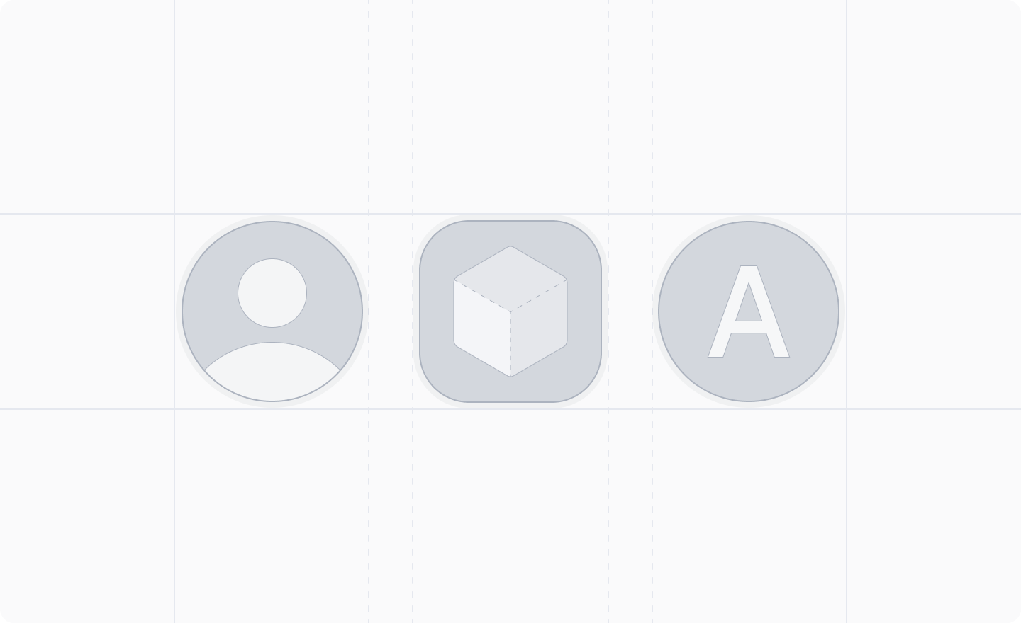
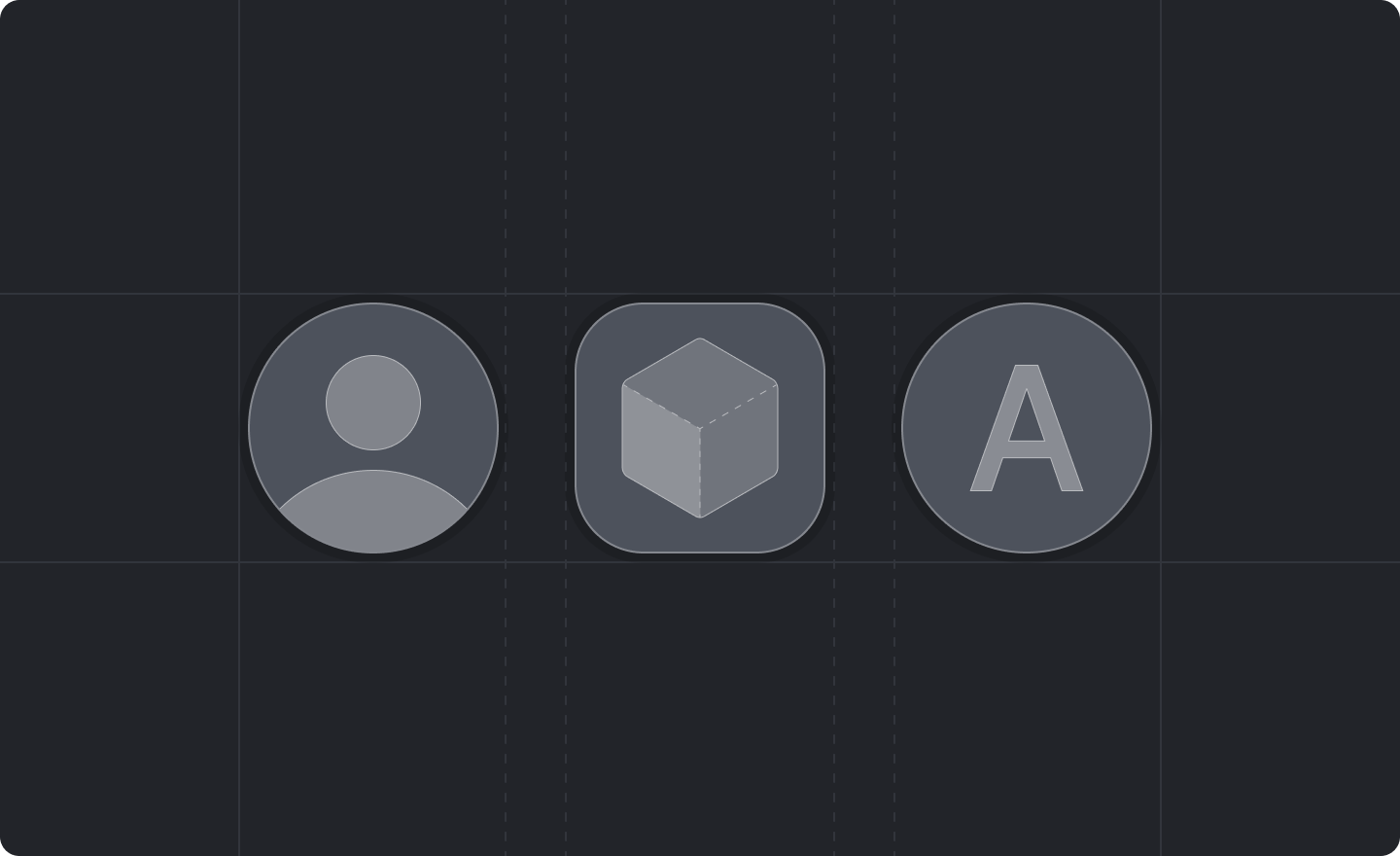
> An avatar component for displaying profile pictures or organization logos.
 ```js theme={"system"}
import {Avatar} from "attio/client"
```
## Example
```jsx theme={"system"}
```
## Props
The name of the person or organization represented by the avatar. This is used for accessibility
and may also be used as a fallback display when no image is provided.
The source URL of the avatar image. If not provided or if the image fails to load, the avatar will
typically display initials or a fallback representation based on the name.
The shape of the avatar.
Defaults to `'round'`.
The visual variant of the avatar, affecting its styling and prominence.
Defaults to `'bold'`.
The size of the avatar.
* `'small'` - `16px`
* `'medium'` - `24px`
* `'large'` - `32px`
Defaults to `'medium'`.
```js theme={"system"}
import {Avatar} from "attio/client"
```
## Example
```jsx theme={"system"}
```
## Props
The name of the person or organization represented by the avatar. This is used for accessibility
and may also be used as a fallback display when no image is provided.
The source URL of the avatar image. If not provided or if the image fails to load, the avatar will
typically display initials or a fallback representation based on the name.
The shape of the avatar.
Defaults to `'round'`.
The visual variant of the avatar, affecting its styling and prominence.
Defaults to `'bold'`.
The size of the avatar.
* `'small'` - `16px`
* `'medium'` - `24px`
* `'large'` - `32px`
Defaults to `'medium'`.