> ## Documentation Index
> Fetch the complete documentation index at: https://docs.attio.com/llms.txt
> Use this file to discover all available pages before exploring further.

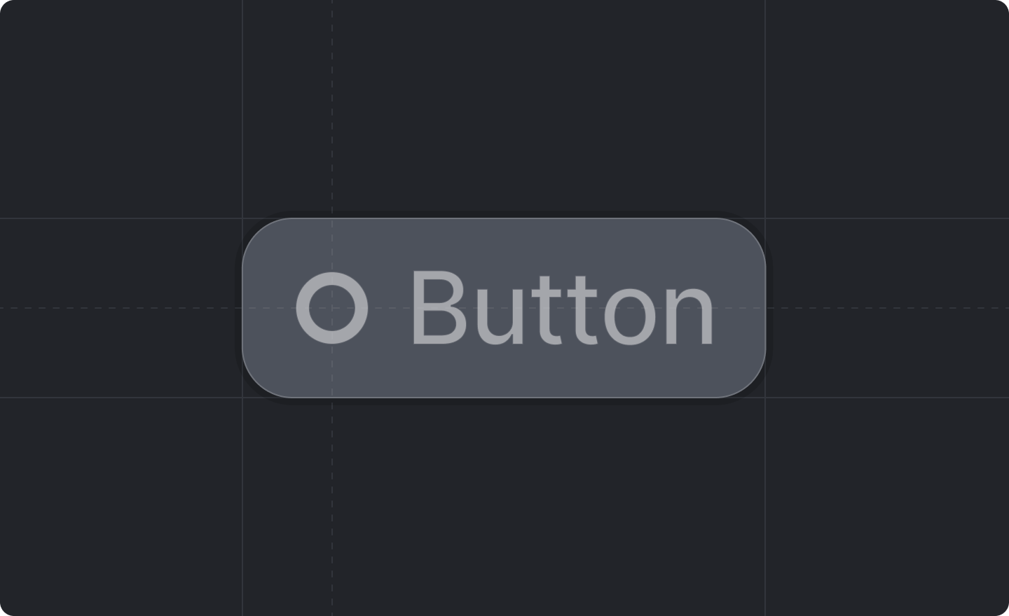
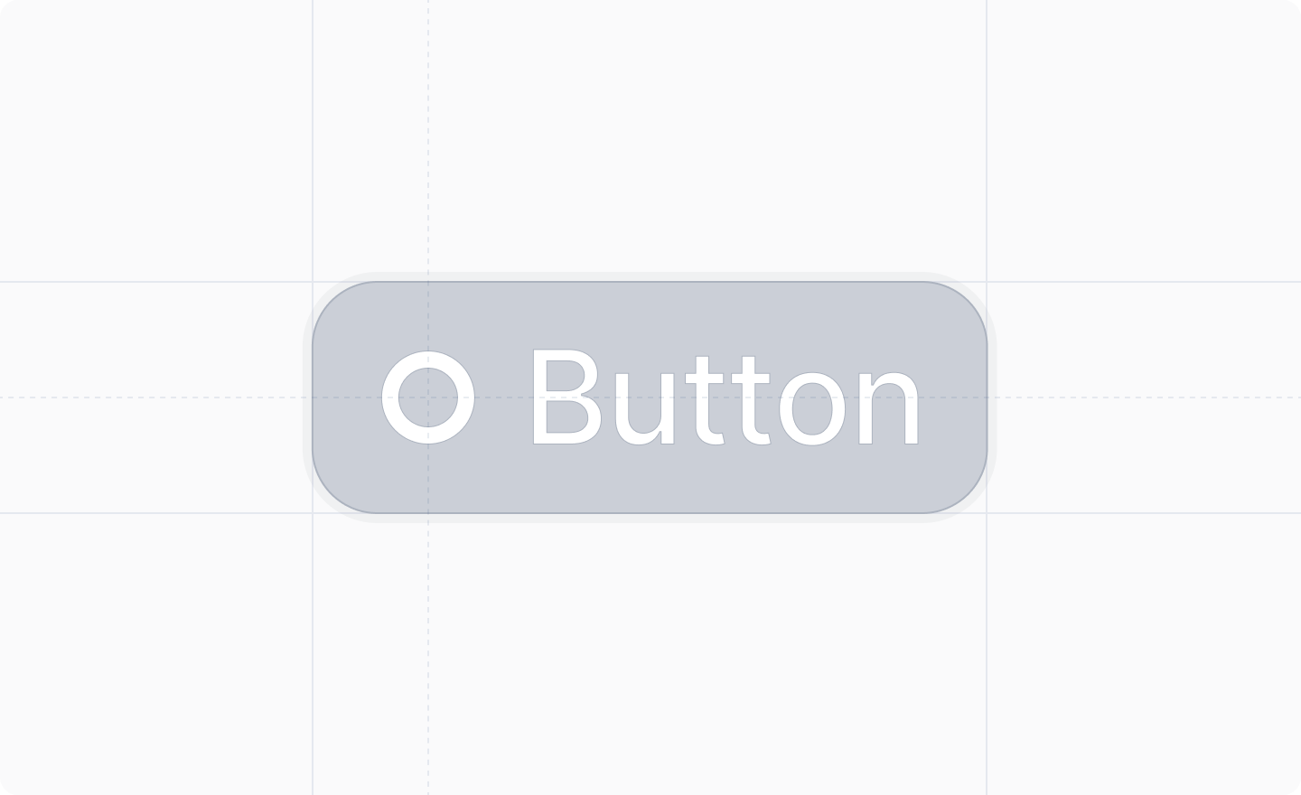
# <Button />

> A button component.

<img className="dark:hidden" width="720" height="440" noZoom src="https://mintcdn.com/attio/4Fh2EPa8-SlLTNAV/images/button.png?fit=max&auto=format&n=4Fh2EPa8-SlLTNAV&q=85&s=69d5467fd63a40631b69710d519aac4b" data-path="images/button.png" />

<img className="hidden dark:block" width="720" height="440" noZoom src="https://mintcdn.com/attio/4Fh2EPa8-SlLTNAV/images/button-dark.png?fit=max&auto=format&n=4Fh2EPa8-SlLTNAV&q=85&s=56a87bc561469ef27e7b30c2d2f16bc2" data-path="images/button-dark.png" />

```js theme={"system"}
import {Button} from "attio/client"
```

Any buttons placed inside a dialog will be rendered at the bottom of the dialog.

## Example

```jsx theme={"system"}
<Button
  label="Remove"
  variant="destructive"
  keyboardHint="x"
  onClick={() => {
    // code here
  }}
/>
```

## Props

<ParamField path="label" type="string" required>
  The text of the button.
</ParamField>

<ParamField path="onClick" type="() => void" required>
  A function that will be called if the user clicks the button.
</ParamField>

<ParamField path="variant" type="'secondary' | 'destructive'">
  The style of the button.

  Defaults to `"secondary"`.

  <Tip>The only way to have a "primary" button is to use a [submit button](./forms/submit-button).</Tip>
</ParamField>

<ParamField path="disabled" type="boolean">
  Whether or not the button is disabled.

  Defaults to `false`.
</ParamField>

<ParamField path="icon" type="AttioIcon">
  An optional [`AttioIcon`](../icons) to display in the button.
</ParamField>

<ParamField path="keyboardHint" type="KeyboardKey">
  An optional [keyboard shortcut](./keyboard-key) that will fire the button.
</ParamField>