> ## Documentation Index
> Fetch the complete documentation index at: https://docs.attio.com/llms.txt
> Use this file to discover all available pages before exploring further.

# <DescriptionList />

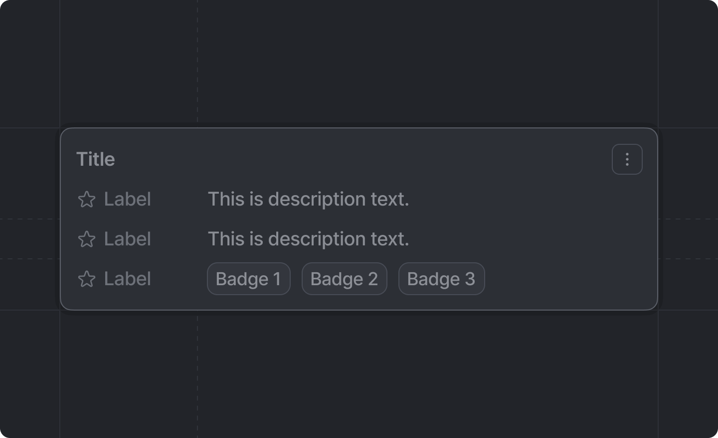
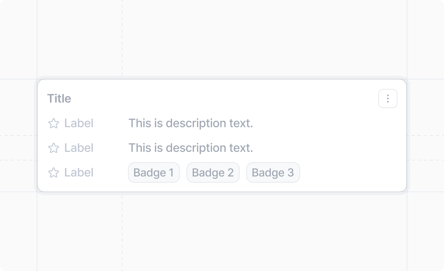
> A component displaying label-value information.

<img className="dark:hidden" width="720" height="440" noZoom src="https://mintcdn.com/attio/L6-QoH-_PHztE_ad/images/description-list.png?fit=max&auto=format&n=L6-QoH-_PHztE_ad&q=85&s=adb84cf579e204842b3212cb0d1bf18d" data-path="images/description-list.png" />

<img className="hidden dark:block" width="720" height="440" noZoom src="https://mintcdn.com/attio/L6-QoH-_PHztE_ad/images/description-list-dark.png?fit=max&auto=format&n=L6-QoH-_PHztE_ad&q=85&s=c9dabe4754d34e639562031fbc359964" data-path="images/description-list-dark.png" />

```js theme={"system"}
import {DescriptionList} from "attio/client"
```

It can be thought of as analogous to the [`<dl>`, `<dt>`, and `<dd>` HTML tags](https://developer.mozilla.org/en-US/docs/Web/HTML/Reference/Elements/dl).

## Example

```tsx TypeScript theme={"system"}
import {DescriptionList, Badge, Link} from "attio/client"

export function InformationDialog() {
  const handleEdit = () => {
    // Handle edit action
  }

  const handleDelete = () => {
    // Handle delete action
  }

  return (
    <DescriptionList title="Cryptids of Cornwall">
      <DescriptionList.Item label="Beast of Bodmin" icon="Eye">
        A large feline inhabiting Bodmin Moor.
      </DescriptionList.Item>
      <DescriptionList.Item label="Morgawr" icon="GlobeHemisphereEast">
        A sea serpent.
      </DescriptionList.Item>
      <DescriptionList.Item label="Owlman" icon="Moon">
        A giant owl-like creature.
      </DescriptionList.Item>
      <DescriptionList.Item label="Categories" icon="Tag">
        <Badge color="blue">Folklore</Badge>
        <Badge color="amber">Cornwall</Badge>
        <Badge color="lavender">Paranormal</Badge>
      </DescriptionList.Item>
      <DescriptionList.Menu>
        <DescriptionList.Menu.Item label="Edit" icon="Edit" onSelect={handleEdit} />
        <DescriptionList.Menu.Item
          label="Delete"
          icon="Trash"
          variant="danger"
          onSelect={handleDelete}
        />
      </DescriptionList.Menu>
    </DescriptionList>
  )
}
```

## Props

<ParamField path="title" type="string">
  An optional title to display in the description list.
</ParamField>

<ParamField path="children" type="React.ReactNode" required>
  The `<DescriptionList.Item />`s and optional `<DescriptionList.Menu />` with the information to display.

  <Tip>
    An `<DescriptionList />` component can *only* have `<DescriptionList.Item />`s and an optional `<DescriptionList.Menu />` as children.
  </Tip>
</ParamField>

# `<DescriptionList.Item />`

An item with information.

## Props

<ParamField path="label" type="string" required>
  The label of the information.
</ParamField>

<ParamField path="icon" type="Icon">
  An optional [Attio Icon](../icons).
</ParamField>

<ParamField path="children" type="React.ReactNode" required>
  The information corresponding to the label.

  <Tip>
    An `<DescriptionList.Item />` can contain *either* text (including [`<Link />`](./link)s), *or*
    [`<Badge />`](./badge)s, but never both.
  </Tip>
</ParamField>

# `<DescriptionList.Menu />`

A dropdown menu for the description list, displayed as a three-dot icon button. It aligns with the title if provided, or with the first item if no title is set.

## Props

<ParamField path="children" type="React.ReactNode" required>
  The `<DescriptionList.Menu.Item />`s to display in the menu.
</ParamField>

# `<DescriptionList.Menu.Item />`

A menu item within a `<DescriptionList.Menu />`.

## Props

<ParamField path="label" type="string" required>
  The label of the menu item.
</ParamField>

<ParamField path="icon" type="Icon">
  An optional [Attio Icon](../icons) for the menu item.
</ParamField>

<ParamField path="variant" type="'primary' | 'danger'">
  The visual variant of the menu item. Use `"danger"` for destructive actions.
</ParamField>

<ParamField path="onSelect" type="() => void" required>
  The callback to invoke when the menu item is selected.
</ParamField>