> ## Documentation Index
> Fetch the complete documentation index at: https://docs.attio.com/llms.txt
> Use this file to discover all available pages before exploring further.

# <RadioGroup />

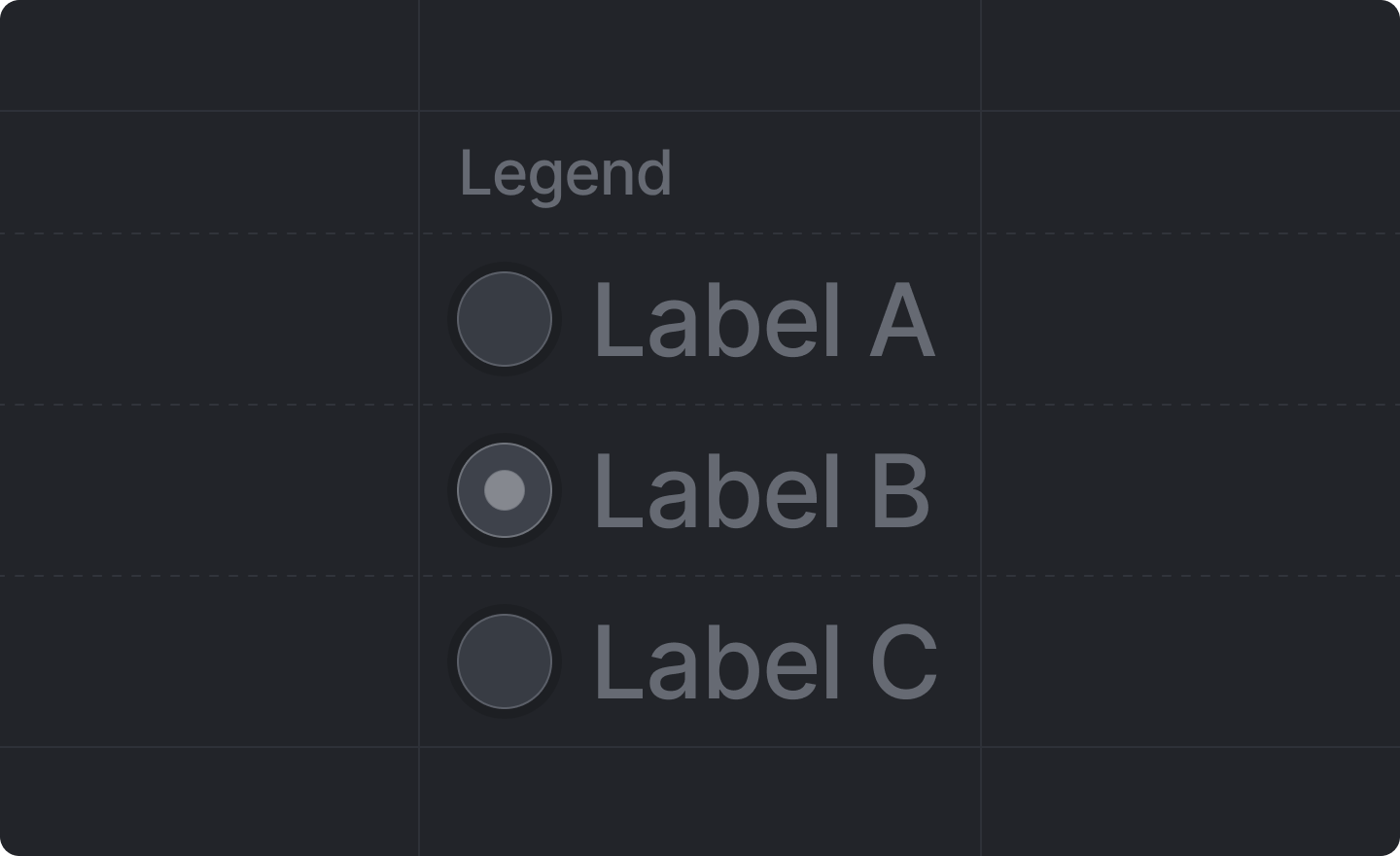
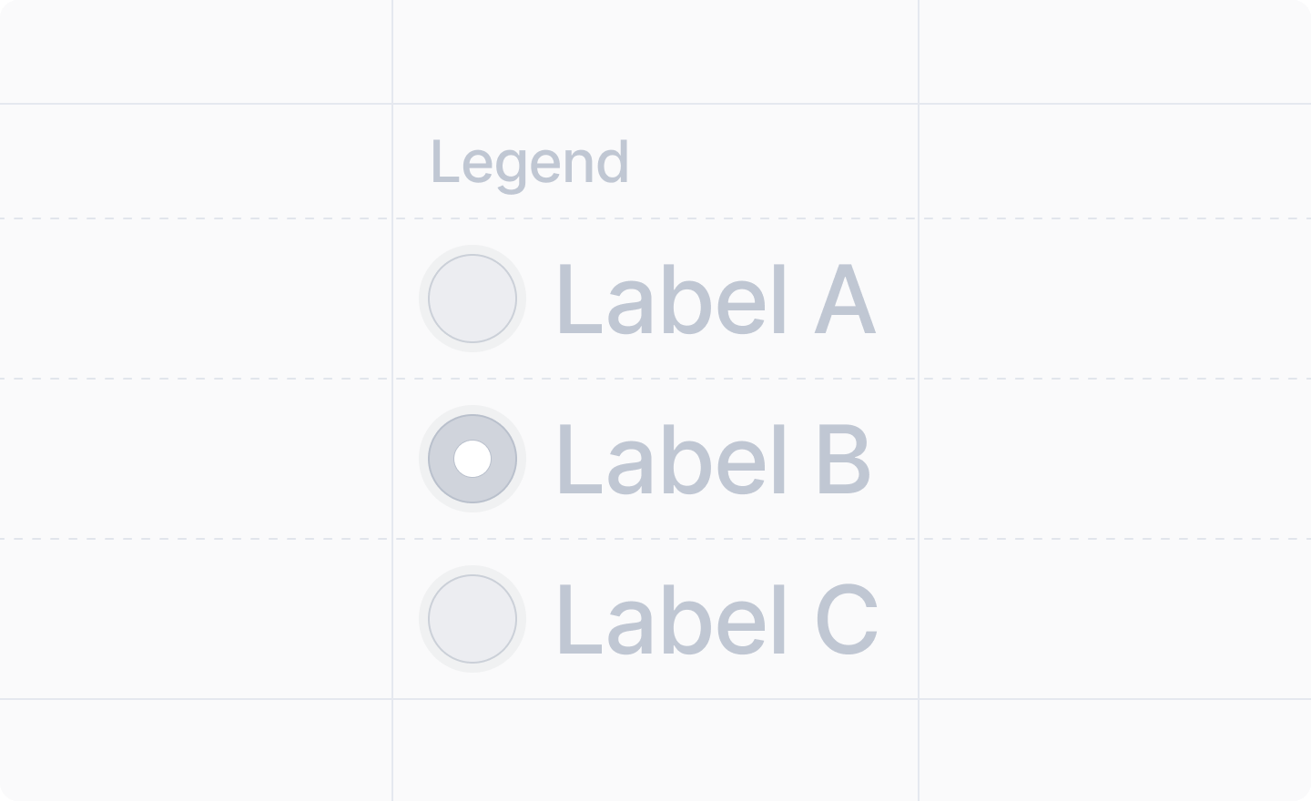
> A radio group input field for selecting a single option from a list.

export const ExperimentalWarning = ({api}) => <Note>
    The <code>{api}</code> API is experimental and may change in the future. It has been marked as{" "}
    <code>@deprecated</code> to remind the developer that it is experimental.{" "}
    <strong>
      It is <em>not</em> "deprecated", just experimental.
    </strong>{" "}
    Please don't use it in production versions of your app. We do not guarantee backward
    compatibility, or that the API will remain stable.
  </Note>;

<img className="dark:hidden" width="720" height="440" noZoom src="https://mintcdn.com/attio/MtV7U9CRhT0ouJbz/images/radio-group.png?fit=max&auto=format&n=MtV7U9CRhT0ouJbz&q=85&s=06a9447b217bcf4bf568899d1c61a84b" data-path="images/radio-group.png" />

<img className="hidden dark:block" width="720" height="440" noZoom src="https://mintcdn.com/attio/MtV7U9CRhT0ouJbz/images/radio-group-dark.png?fit=max&auto=format&n=MtV7U9CRhT0ouJbz&q=85&s=d8c27158ee560f199d605c9b5af5ee24" data-path="images/radio-group-dark.png" />

<Note>This component is returned by [`useForm()`](../../forms/use-form).</Note>

<ExperimentalWarning api="RadioGroup" />

## Example

```tsx radio-group-dialog.tsx theme={"system"}
import React from "react"
import {Forms, useForm, showToast} from "attio/client"

export function RadioGroupDialog() {
  const {Form, SubmitButton, RadioGroup} = useForm(
    {
      department: Forms.string(),
    },
    {
      department: "engineering",
    },
  )
  return (
    <Form
      onSubmit={async (values) => {
        await showToast({
          title: "Form submitted",
          variant: "success",
          text: `Selected department: ${values.department}`,
        })
      }}
    >
      <RadioGroup name="department">
        <RadioGroup.Item value="engineering" label="Engineering" />
        <RadioGroup.Item value="sales" label="Sales" />
        <RadioGroup.Item value="marketing" label="Marketing" />
        <RadioGroup.Item value="support" label="Support" />
      </RadioGroup>
      <SubmitButton label="Submit" />
    </Form>
  )
}
```

## Adding a legend

To add a legend to your radio group, wrap it in a [`<Fieldset />`](./fieldset):

```tsx theme={"system"}
<Fieldset legend="Department">
  <RadioGroup name="department">
    <RadioGroup.Item value="engineering" label="Engineering" />
    <RadioGroup.Item value="sales" label="Sales" />
  </RadioGroup>
</Fieldset>
```

## Props

<ParamField path="name" type="string" required>
  The path to the `string` value of the radio group field in your [form schema](../../forms/form-schema).

  e.g. `"department"`, `"shipping.method"`
</ParamField>

<ParamField path="disabled" type="boolean">
  Whether or not the radio group should be disabled.

  Defaults to `false` (not disabled).
</ParamField>

<ParamField path="children" type="React.ReactNode" required>
  The `<RadioGroup.Item />`s representing the available options.

  <Tip>
    A `<RadioGroup />` component should only have `<RadioGroup.Item />`s as children.
  </Tip>
</ParamField>

# `<RadioGroup.Item />`

A radio group item representing a single selectable option.

## Props

<ParamField path="value" type="string" required>
  The value of the radio item that will be stored in the form when selected.
</ParamField>

<ParamField path="label" type="string" required>
  The label displayed next to the radio item.
</ParamField>