> ## Documentation Index
> Fetch the complete documentation index at: https://docs.attio.com/llms.txt
> Use this file to discover all available pages before exploring further.
#
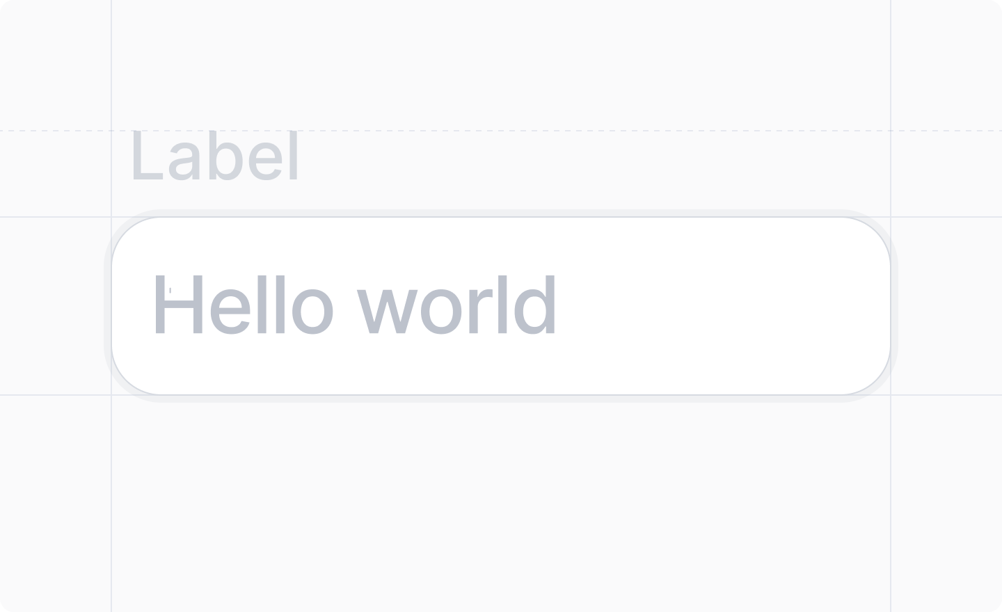
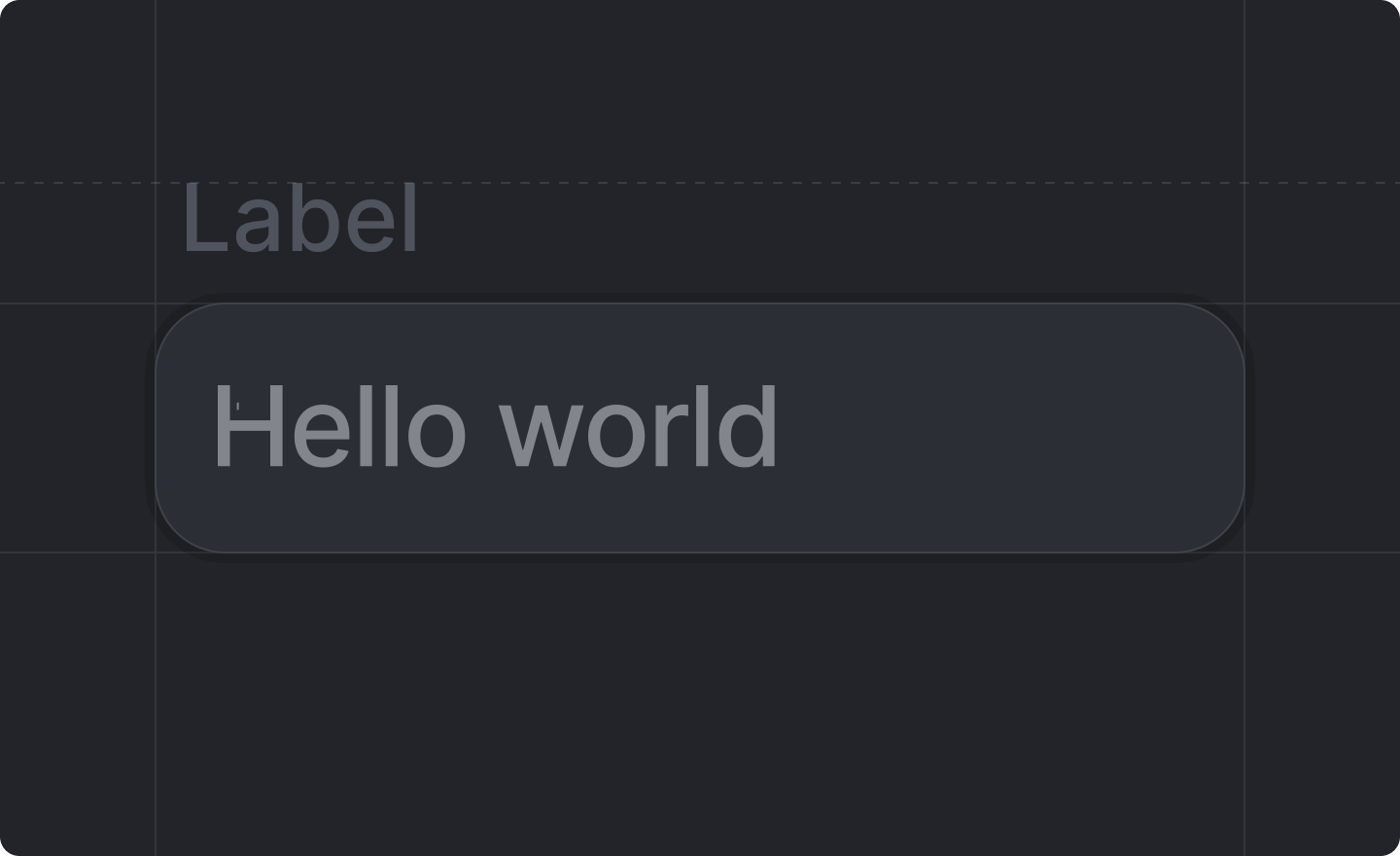
> A string input field.
 This component is returned by [`useForm()`](../../forms/use-form).
Use `` for single-line string fields. For multi-line text (e.g. descriptions, notes, or comments), use [``](./text-area) instead. The component binds to a `string` field in your [form schema](../../forms/form-schema).
## Example
```tsx form-text-input-dialog.tsx theme={"system"}
import React from "react"
import {Forms, useForm, showToast} from "attio/client"
export function FormTextInputDialog() {
const {Form, SubmitButton, TextInput} = useForm(
{
firstName: Forms.string(),
lastName: Forms.string(),
},
{
firstName: "",
lastName: "",
},
)
return (
)
}
```
## Props
The label of the input field.
The path to the `string` value of the input field in your [form schema](../../forms/form-schema).
e.g. `"name"`, `"shipping.address.street"`
The type of the input field.
They roughly correspond to the HTML types
[`text`](https://developer.mozilla.org/en-US/docs/Web/HTML/Element/input/text),
[`email`](https://developer.mozilla.org/en-US/docs/Web/HTML/Element/input/email),
[`password`](https://developer.mozilla.org/en-US/docs/Web/HTML/Element/input/password),
[`tel`](https://developer.mozilla.org/en-US/docs/Web/HTML/Element/input/tel), and
[`url`](https://developer.mozilla.org/en-US/docs/Web/HTML/Element/input/url).
Defaults to `"text"`.
Useful on mobile devices with virtual keyboards.
An optional placeholder text for your input.
Whether or not the field should be disabled.
Defaults to `false` (not disabled).
This component is returned by [`useForm()`](../../forms/use-form).
Use `` for single-line string fields. For multi-line text (e.g. descriptions, notes, or comments), use [``](./text-area) instead. The component binds to a `string` field in your [form schema](../../forms/form-schema).
## Example
```tsx form-text-input-dialog.tsx theme={"system"}
import React from "react"
import {Forms, useForm, showToast} from "attio/client"
export function FormTextInputDialog() {
const {Form, SubmitButton, TextInput} = useForm(
{
firstName: Forms.string(),
lastName: Forms.string(),
},
{
firstName: "",
lastName: "",
},
)
return (
)
}
```
## Props
The label of the input field.
The path to the `string` value of the input field in your [form schema](../../forms/form-schema).
e.g. `"name"`, `"shipping.address.street"`
The type of the input field.
They roughly correspond to the HTML types
[`text`](https://developer.mozilla.org/en-US/docs/Web/HTML/Element/input/text),
[`email`](https://developer.mozilla.org/en-US/docs/Web/HTML/Element/input/email),
[`password`](https://developer.mozilla.org/en-US/docs/Web/HTML/Element/input/password),
[`tel`](https://developer.mozilla.org/en-US/docs/Web/HTML/Element/input/tel), and
[`url`](https://developer.mozilla.org/en-US/docs/Web/HTML/Element/input/url).
Defaults to `"text"`.
Useful on mobile devices with virtual keyboards.
An optional placeholder text for your input.
Whether or not the field should be disabled.
Defaults to `false` (not disabled).