> ## Documentation Index
> Fetch the complete documentation index at: https://docs.attio.com/llms.txt
> Use this file to discover all available pages before exploring further.
#
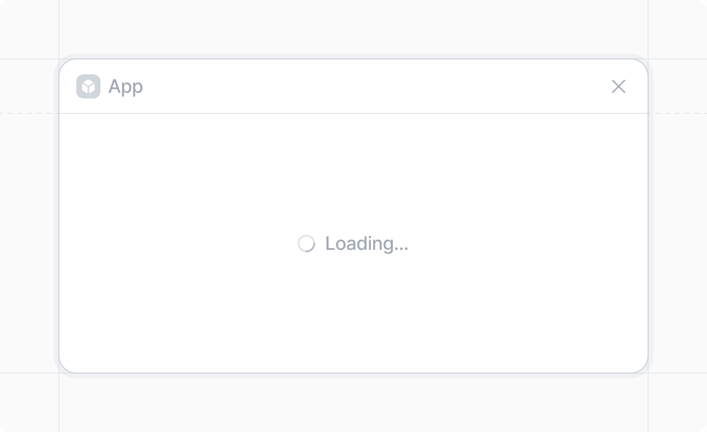
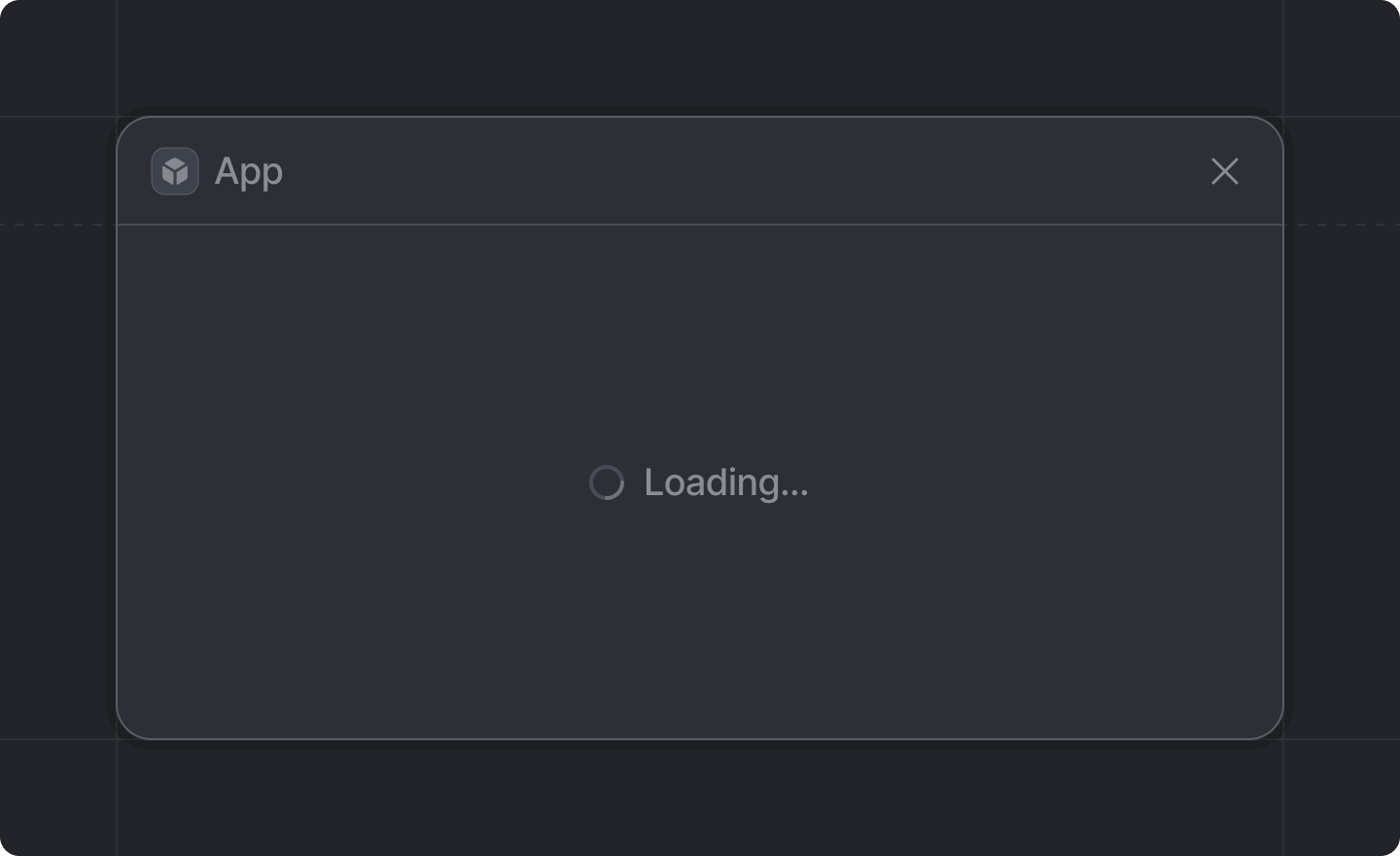
> A component for showing a loading spinner.
 ```js theme={"system"}
import {LoadingState} from "attio/client"
```
When used inside a [dialog](../dialogs/show-dialog), this component will fill the entire Dialog, hiding any other UI.
`LoadingState` can be very useful as a `fallback` for [`React.Suspense`](https://react.dev/reference/react/Suspense).
[Dialogs](../dialogs/show-dialog) are already suspenseful!
If any React code in your dialog suspends, a loading state will be shown automatically.
This component is only for when you need to control the message shown during loading.
## Props
An optional message to display next to the spinner. e.g. `"Loading contacts..."`.
Defaults to `"Loading..."`.
```js theme={"system"}
import {LoadingState} from "attio/client"
```
When used inside a [dialog](../dialogs/show-dialog), this component will fill the entire Dialog, hiding any other UI.
`LoadingState` can be very useful as a `fallback` for [`React.Suspense`](https://react.dev/reference/react/Suspense).
[Dialogs](../dialogs/show-dialog) are already suspenseful!
If any React code in your dialog suspends, a loading state will be shown automatically.
This component is only for when you need to control the message shown during loading.
## Props
An optional message to display next to the spinner. e.g. `"Loading contacts..."`.
Defaults to `"Loading..."`.