> ## Documentation Index
> Fetch the complete documentation index at: https://docs.attio.com/llms.txt
> Use this file to discover all available pages before exploring further.
#
> A component for displaying a status badge with a color.
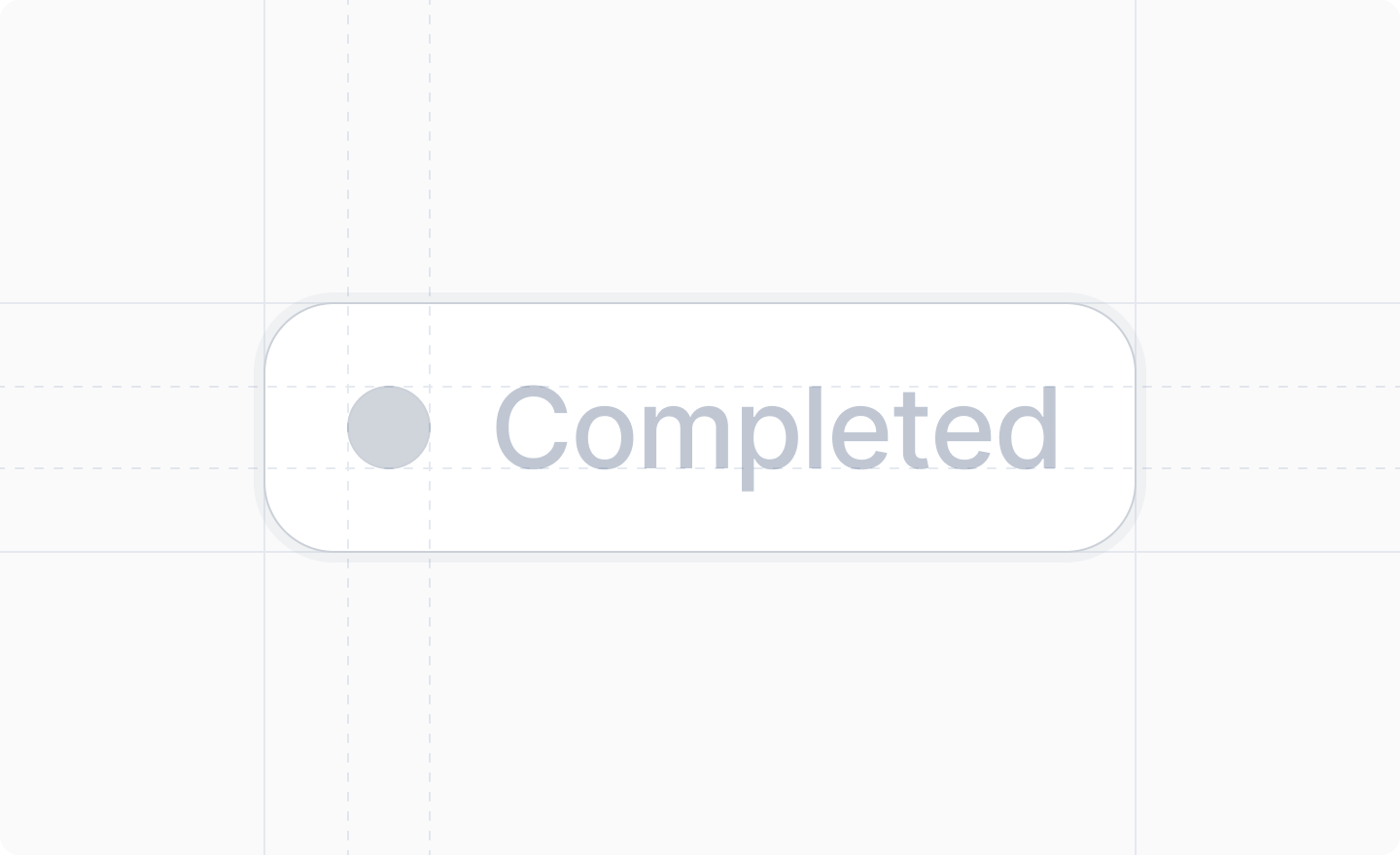
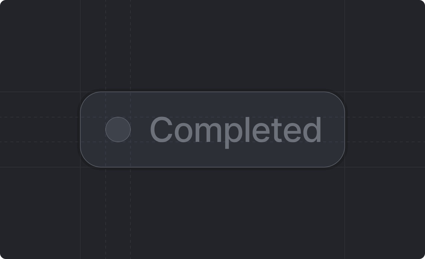 `StatusBadge` is a component that displays a status text with an indicator in any hex color or one of the predefined color names.
## Example
```tsx theme={"system"}
import {StatusBadge} from "attio/client"
export function Example({isActive}: {isActive: boolean}) {
const color = isActive ? "green" : "#FF0000"
const label = isActive ? "Active" : "Inactive"
return {label}
}
```
## Props
The color of the status badge. Can be any hex color (e.g., `"#00D17E"`) or one of the predefined
colors: `"blue"`, `"violet"`, `"pink"`, `"red"`, `"orange"`, `"yellow"`, `"green"`, `"cyan"`, or
`"grey"`.
The text to display in the status badge as a label.
`StatusBadge` is a component that displays a status text with an indicator in any hex color or one of the predefined color names.
## Example
```tsx theme={"system"}
import {StatusBadge} from "attio/client"
export function Example({isActive}: {isActive: boolean}) {
const color = isActive ? "green" : "#FF0000"
const label = isActive ? "Active" : "Inactive"
return {label}
}
```
## Props
The color of the status badge. Can be any hex color (e.g., `"#00D17E"`) or one of the predefined
colors: `"blue"`, `"violet"`, `"pink"`, `"red"`, `"orange"`, `"yellow"`, `"green"`, `"cyan"`, or
`"grey"`.
The text to display in the status badge as a label.