> ## Documentation Index
> Fetch the complete documentation index at: https://docs.attio.com/llms.txt
> Use this file to discover all available pages before exploring further.
#
> A component for displaying tabular data.
```js theme={"system"}
import {Table} from "attio/client"
```
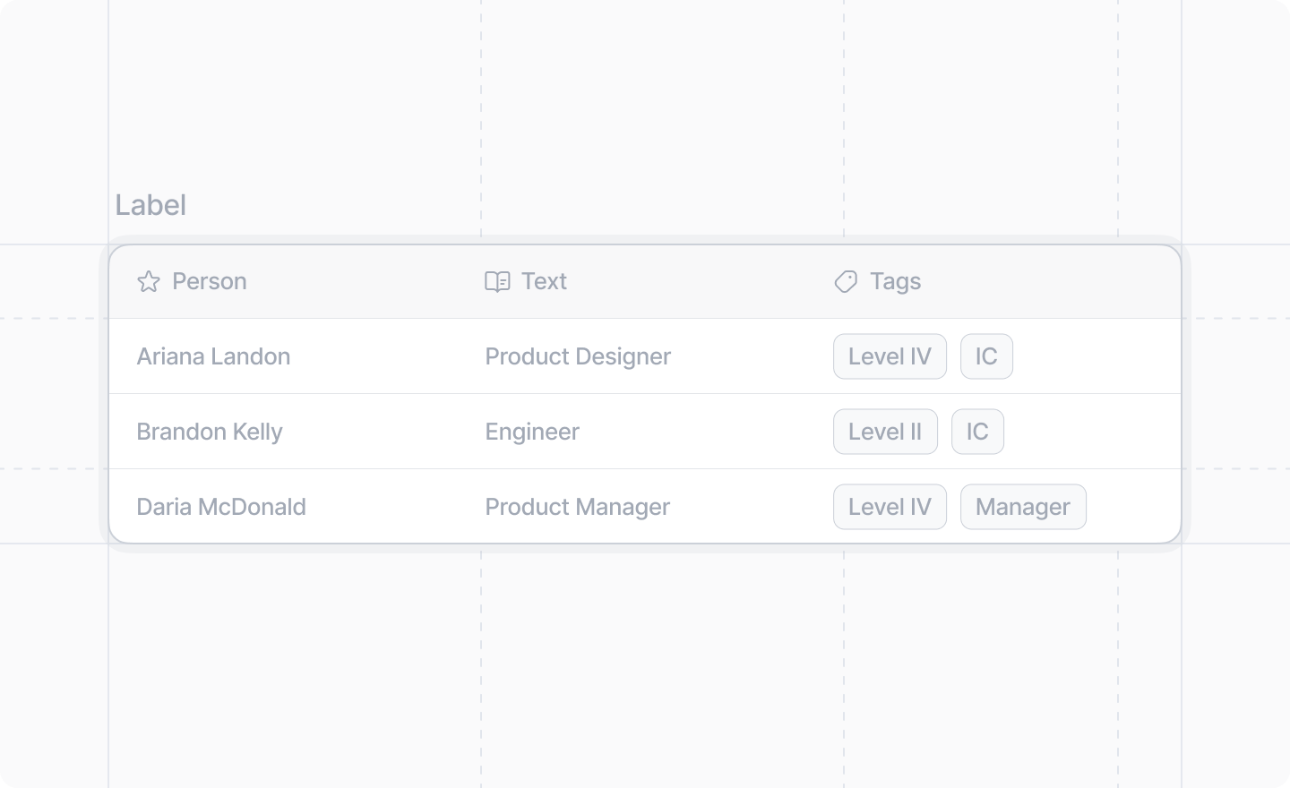
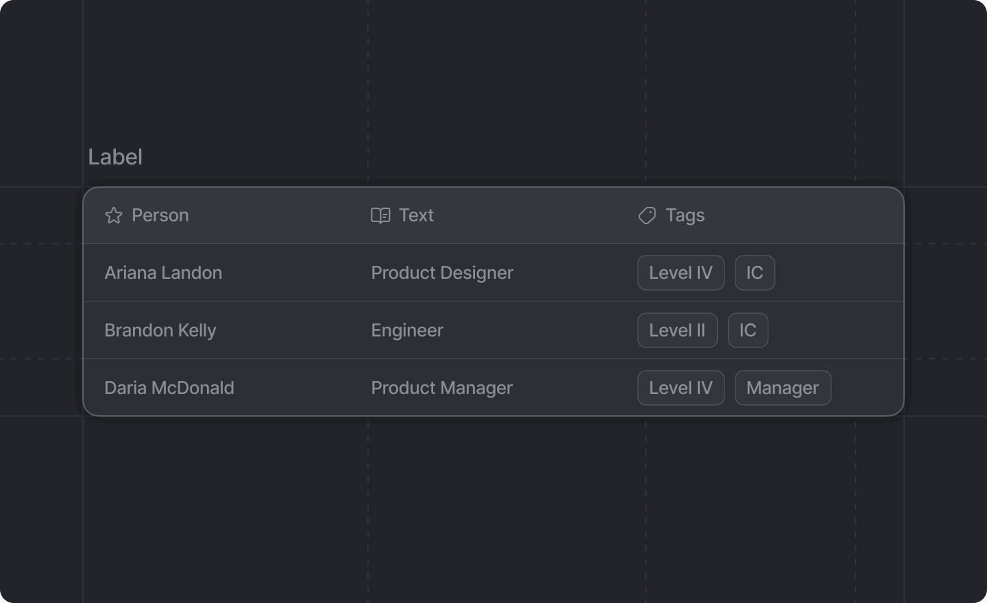
The Table component provides a structured way to display data in rows and columns. It supports headers with optional icons, and cells can contain text, links, badges, or avatars.
## Example
```tsx TypeScript theme={"system"}
import {Table, Link} from "attio/client"
export function MyDialog() {
return (
NameAvatarPortfolioRoleStatusJohn Doe
John's Portfolio
AdminActiveJane Smith
Jane's Portfolio
DeveloperActive
)
}
```
## Props
An optional label to display above the table.
The table structure. Must contain exactly one `` and one ``.
A `
` component must have exactly one `` followed by exactly one `` as children.
# ``
The header row of the table. Contains the column headers.
## Props
The header cells to display.
A `` component can *only* have ``s as children.
# ``
A single header cell in the table header.
## Props
An optional [Attio Icon](../icons) to display next to the header text.
The text content of the header cell.
# ``
The body of the table containing all data rows.
## Props
The table rows.
A `` component can *only* have ``s as children.
# ``
A single data row in the table body.
## Props
The table cells for this row.
Each `` must contain the same number of `` components as there are `` components in the header.
# ``
A single data cell in a table row. Can contain text, links, badges, or avatars.
## Props
The content of the table cell. Can be: - Plain text - Text with [``](./link) components - One or more `` components (if using
badges, the cell must *only* contain badges) - One or more ``
components (if using avatars, the cell must *only* contain avatars)
# ``
A badge component for use inside a table cell. Useful for displaying status indicators or categories.
## Props
The text content of the badge. Only text children are allowed.
The color of the badge.
# ``
An avatar component for use inside a table cell. Useful for displaying profile pictures or organization logos.
## Props
The name of the person or entity represented by the avatar. This is used for accessibility and as
a fallback when no image is provided.
The URL of the avatar image. If `null` or `undefined`, a fallback representation based on the name
will be displayed.
 ```js theme={"system"}
import {Table} from "attio/client"
```
The Table component provides a structured way to display data in rows and columns. It supports headers with optional icons, and cells can contain text, links, badges, or avatars.
## Example
```tsx TypeScript theme={"system"}
import {Table, Link} from "attio/client"
export function MyDialog() {
return (
```js theme={"system"}
import {Table} from "attio/client"
```
The Table component provides a structured way to display data in rows and columns. It supports headers with optional icons, and cells can contain text, links, badges, or avatars.
## Example
```tsx TypeScript theme={"system"}
import {Table, Link} from "attio/client"
export function MyDialog() {
return (