> ## Documentation Index
> Fetch the complete documentation index at: https://docs.attio.com/llms.txt
> Use this file to discover all available pages before exploring further.
#
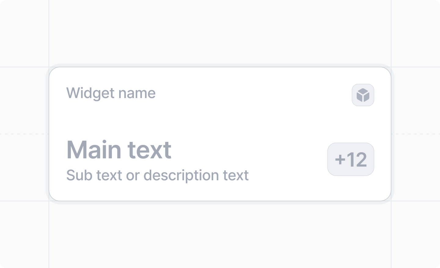
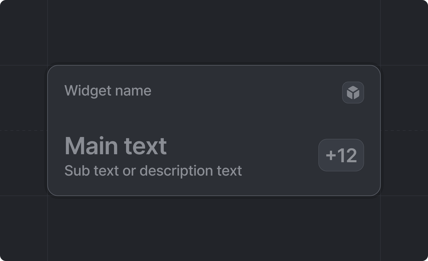
> Text widget that can be shown on a record page.
 ```js theme={"system"}
import {Widget} from "attio/client"
```
## Example
```jsx theme={"system"}
{
// do something
}}
>
Title
Main text
Description text
42
```
## Props
An optional function that will be called when a user clicks on the widget.
A text widget can have – at least one – of the following children:
* [`Widget.Title`](./title)
* [`Widget.Text.Primary`](./text-primary)
* [`Widget.Text.Secondary`](./text-secondary)
* [`Widget.Loading`](./loading)
* [`Widget.Decoration`](./decoration)
Not all of them are required.
If you do not provide a `` your app's name will be used.
At least one text component is required for the badge to be displayed.
```js theme={"system"}
import {Widget} from "attio/client"
```
## Example
```jsx theme={"system"}
{
// do something
}}
>
Title
Main text
Description text
42
```
## Props
An optional function that will be called when a user clicks on the widget.
A text widget can have – at least one – of the following children:
* [`Widget.Title`](./title)
* [`Widget.Text.Primary`](./text-primary)
* [`Widget.Text.Secondary`](./text-secondary)
* [`Widget.Loading`](./loading)
* [`Widget.Decoration`](./decoration)
Not all of them are required.
If you do not provide a `` your app's name will be used.
At least one text component is required for the badge to be displayed.