> ## Documentation Index
> Fetch the complete documentation index at: https://docs.attio.com/llms.txt
> Use this file to discover all available pages before exploring further.
#
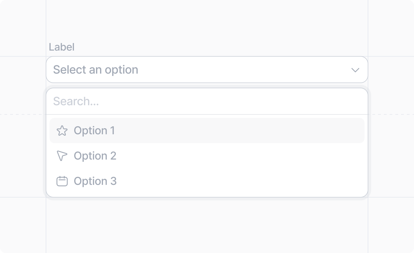
> A combobox input.
 This component is returned by
[`Settings.useForm()`](../../settings/use-form).
Options can be provided either synchronously (static or already loaded) or asynchronously (based on a search).
## Example: Pre-defined options
```tsx src/app/settings/page.tsx theme={"system"}
import React from "react"
import {Settings, ComboboxOption, TextBlock} from "attio/client"
import schema from "./schema"
const syncFrequencyOptions = [
{label: "Every 5 minutes", value: "5m"},
{label: "Every 15 minutes", value: "15m"},
{label: "Every hour", value: "1h"},
] satisfies ComboboxOption[]
export default Settings.defineWorkspacePage(schema, () => {
const {Form, Combobox} = Settings.useForm(schema)
return (
)
})
```
## Example: Asynchronously loaded options
```ts github-user-schema.ts theme={"system"}
import {z} from "zod"
export const githubUserSchema = z.object({
id: z.number(),
login: z.string(),
})
export type GithubUser = z.infer
```
Because we cannot `fetch()` from the client, we need to define server functions
to talk to the third party API.
```ts get-github-user.server.ts theme={"system"}
import {GithubUser, githubUserSchema} from "./github-user-schema"
export default async function getGithubUser(id: string): Promise {
const user = await fetch(`https://api.github.com/users/${id}`)
const userData = await user.json()
const parsed = githubUserSchema.safeParse(userData)
if (!parsed.success) {
return undefined
}
return parsed.data
}
```
```ts search-github-users.server.ts theme={"system"}
import {GithubUser, githubUserSchema} from "./github-user-schema"
export default async function searchGithubUsers(search: string): Promise {
const users = await fetch(`https://api.github.com/search/users?q=${search}`)
const usersData = await users.json()
const parsed = githubUserSchema.array().safeParse(usersData.items)
if (!parsed.success) {
return []
}
return parsed.data
}
```
Now we can create our async combobox options provider.
```ts github-options-provider.ts theme={"system"}
import {ComboboxOptionsProvider} from "attio/client"
import getGithubUser from "./get-github-user.server"
import searchGithubUsers from "./search-github-users.server"
export const githubUserOptionsProvider = {
getOption: async (value: string) => {
const user = await getGithubUser(value)
return user ? {label: user.login} : undefined
},
search: async (search: string) => {
const users = await searchGithubUsers(search)
return users.map((user) => ({
value: user.id.toString(),
label: user.login,
}))
},
} satisfies ComboboxOptionsProvider
```
And then we give that options provider to the ``.
```tsx src/app/settings/page.tsx theme={"system"}
import React from "react"
import {Settings, TextBlock} from "attio/client"
import schema from "./schema"
import {githubUserOptionsProvider} from "./github-users-options-provider"
export default Settings.defineWorkspacePage(schema, () => {
const {Form, Combobox} = Settings.useForm(schema)
return (
)
})
```
## Props
The label of the combobox field.
The key of the `string` value of the input field in your [settings schema](../../settings/define-workspace-schema).
e.g. `"sync_frequency"`
Either an array of [ComboboxOption](#comboboxoption)s, or a
[ComboboxOptionsProvider](#comboboxoptionsprovider) to load them.
An optional placeholder text for your input.
Whether or not the field should be disabled.
# ComboboxOption
An object containing:
The value that will be saved into your form data when this option is selected.
The label the user will see for this option
An optional description the user will see for this option
An optional avatar to display for this option
An optional icon to display for this option, an [`AttioIcon`](../../icons).
An optional CSS color for the option. It will be displayed in a little circle next to the label.
## Combobox Option Decorations
The priority of decorations goes:
1. Avatar
2. Color
3. Icon
e.g. If there is an avatar, it will be shown; else if there is a color, it will be shown, etc.
# CategorizedComboboxOption
An object that extends `ComboboxOption` and also includes:
A category label to display this option under
# ComboboxOptionProvider
An object containing:
An async function that, given an option value, fetches the rest of the
[`ComboboxOption`](#comboboxoption).
An async function that, given a search query, fetches an array of “matching” [`ComboboxOption`](#comboboxoption)s.
What “matching” means is up to the developer.
This component is returned by
[`Settings.useForm()`](../../settings/use-form).
Options can be provided either synchronously (static or already loaded) or asynchronously (based on a search).
## Example: Pre-defined options
```tsx src/app/settings/page.tsx theme={"system"}
import React from "react"
import {Settings, ComboboxOption, TextBlock} from "attio/client"
import schema from "./schema"
const syncFrequencyOptions = [
{label: "Every 5 minutes", value: "5m"},
{label: "Every 15 minutes", value: "15m"},
{label: "Every hour", value: "1h"},
] satisfies ComboboxOption[]
export default Settings.defineWorkspacePage(schema, () => {
const {Form, Combobox} = Settings.useForm(schema)
return (
)
})
```
## Example: Asynchronously loaded options
```ts github-user-schema.ts theme={"system"}
import {z} from "zod"
export const githubUserSchema = z.object({
id: z.number(),
login: z.string(),
})
export type GithubUser = z.infer
```
Because we cannot `fetch()` from the client, we need to define server functions
to talk to the third party API.
```ts get-github-user.server.ts theme={"system"}
import {GithubUser, githubUserSchema} from "./github-user-schema"
export default async function getGithubUser(id: string): Promise {
const user = await fetch(`https://api.github.com/users/${id}`)
const userData = await user.json()
const parsed = githubUserSchema.safeParse(userData)
if (!parsed.success) {
return undefined
}
return parsed.data
}
```
```ts search-github-users.server.ts theme={"system"}
import {GithubUser, githubUserSchema} from "./github-user-schema"
export default async function searchGithubUsers(search: string): Promise {
const users = await fetch(`https://api.github.com/search/users?q=${search}`)
const usersData = await users.json()
const parsed = githubUserSchema.array().safeParse(usersData.items)
if (!parsed.success) {
return []
}
return parsed.data
}
```
Now we can create our async combobox options provider.
```ts github-options-provider.ts theme={"system"}
import {ComboboxOptionsProvider} from "attio/client"
import getGithubUser from "./get-github-user.server"
import searchGithubUsers from "./search-github-users.server"
export const githubUserOptionsProvider = {
getOption: async (value: string) => {
const user = await getGithubUser(value)
return user ? {label: user.login} : undefined
},
search: async (search: string) => {
const users = await searchGithubUsers(search)
return users.map((user) => ({
value: user.id.toString(),
label: user.login,
}))
},
} satisfies ComboboxOptionsProvider
```
And then we give that options provider to the ``.
```tsx src/app/settings/page.tsx theme={"system"}
import React from "react"
import {Settings, TextBlock} from "attio/client"
import schema from "./schema"
import {githubUserOptionsProvider} from "./github-users-options-provider"
export default Settings.defineWorkspacePage(schema, () => {
const {Form, Combobox} = Settings.useForm(schema)
return (
)
})
```
## Props
The label of the combobox field.
The key of the `string` value of the input field in your [settings schema](../../settings/define-workspace-schema).
e.g. `"sync_frequency"`
Either an array of [ComboboxOption](#comboboxoption)s, or a
[ComboboxOptionsProvider](#comboboxoptionsprovider) to load them.
An optional placeholder text for your input.
Whether or not the field should be disabled.
# ComboboxOption
An object containing:
The value that will be saved into your form data when this option is selected.
The label the user will see for this option
An optional description the user will see for this option
An optional avatar to display for this option
An optional icon to display for this option, an [`AttioIcon`](../../icons).
An optional CSS color for the option. It will be displayed in a little circle next to the label.
## Combobox Option Decorations
The priority of decorations goes:
1. Avatar
2. Color
3. Icon
e.g. If there is an avatar, it will be shown; else if there is a color, it will be shown, etc.
# CategorizedComboboxOption
An object that extends `ComboboxOption` and also includes:
A category label to display this option under
# ComboboxOptionProvider
An object containing:
An async function that, given an option value, fetches the rest of the
[`ComboboxOption`](#comboboxoption).
An async function that, given a search query, fetches an array of “matching” [`ComboboxOption`](#comboboxoption)s.
What “matching” means is up to the developer.