> ## Documentation Index
> Fetch the complete documentation index at: https://docs.attio.com/llms.txt
> Use this file to discover all available pages before exploring further.
#
> A navigatable and clickable list of items in a dialog.
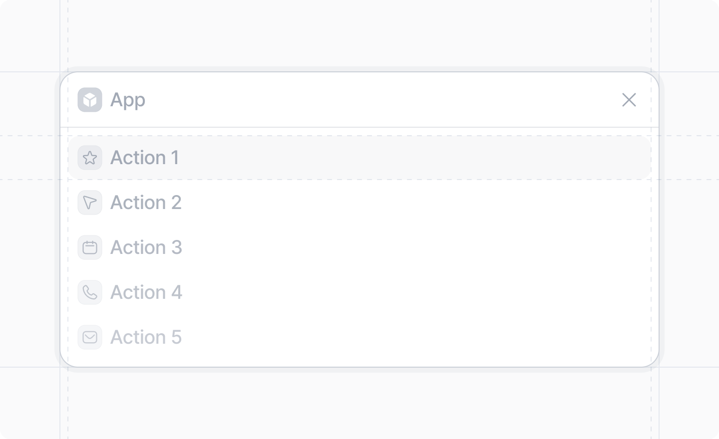
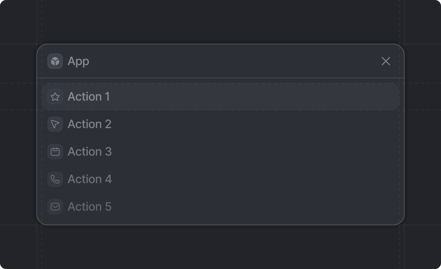 ## Example
```tsx theme={"system"}
import {DialogList, showDialog, StatusBadge} from "attio/client"
const items: Array<{id: string; name: string; url: string; status: string}> = []
showDialog({
title: "My Items",
Dialog: () => {
return (
{items.map((item) => (
{
window.open(item.url)
}}
actionLabel="View item"
suffix={{item.status}}
>
{item.name}
))}
)
},
})
```
## `DialogList` Props
The text to display when the list is empty, and an optional array of actions to display when the
user clicks the empty state.
The children should be a list of `DialogList.Item` components.
## `DialogList.Item` Props
The text to display for the item.
The icon to display for the item.
A function that will be called if the user clicks the item.
The text to display for the action button for the item in the dialog footer. Required if
`onTrigger` is provided.
The suffix to display for the item. Can be a [Typography](/sdk/components/typography) component or
a [StatusBadge](/sdk/components/status-badge) component.
## Example
```tsx theme={"system"}
import {DialogList, showDialog, StatusBadge} from "attio/client"
const items: Array<{id: string; name: string; url: string; status: string}> = []
showDialog({
title: "My Items",
Dialog: () => {
return (
{items.map((item) => (
{
window.open(item.url)
}}
actionLabel="View item"
suffix={{item.status}}
>
{item.name}
))}
)
},
})
```
## `DialogList` Props
The text to display when the list is empty, and an optional array of actions to display when the
user clicks the empty state.
The children should be a list of `DialogList.Item` components.
## `DialogList.Item` Props
The text to display for the item.
The icon to display for the item.
A function that will be called if the user clicks the item.
The text to display for the action button for the item in the dialog footer. Required if
`onTrigger` is provided.
The suffix to display for the item. Can be a [Typography](/sdk/components/typography) component or
a [StatusBadge](/sdk/components/status-badge) component.