Components
<Button />
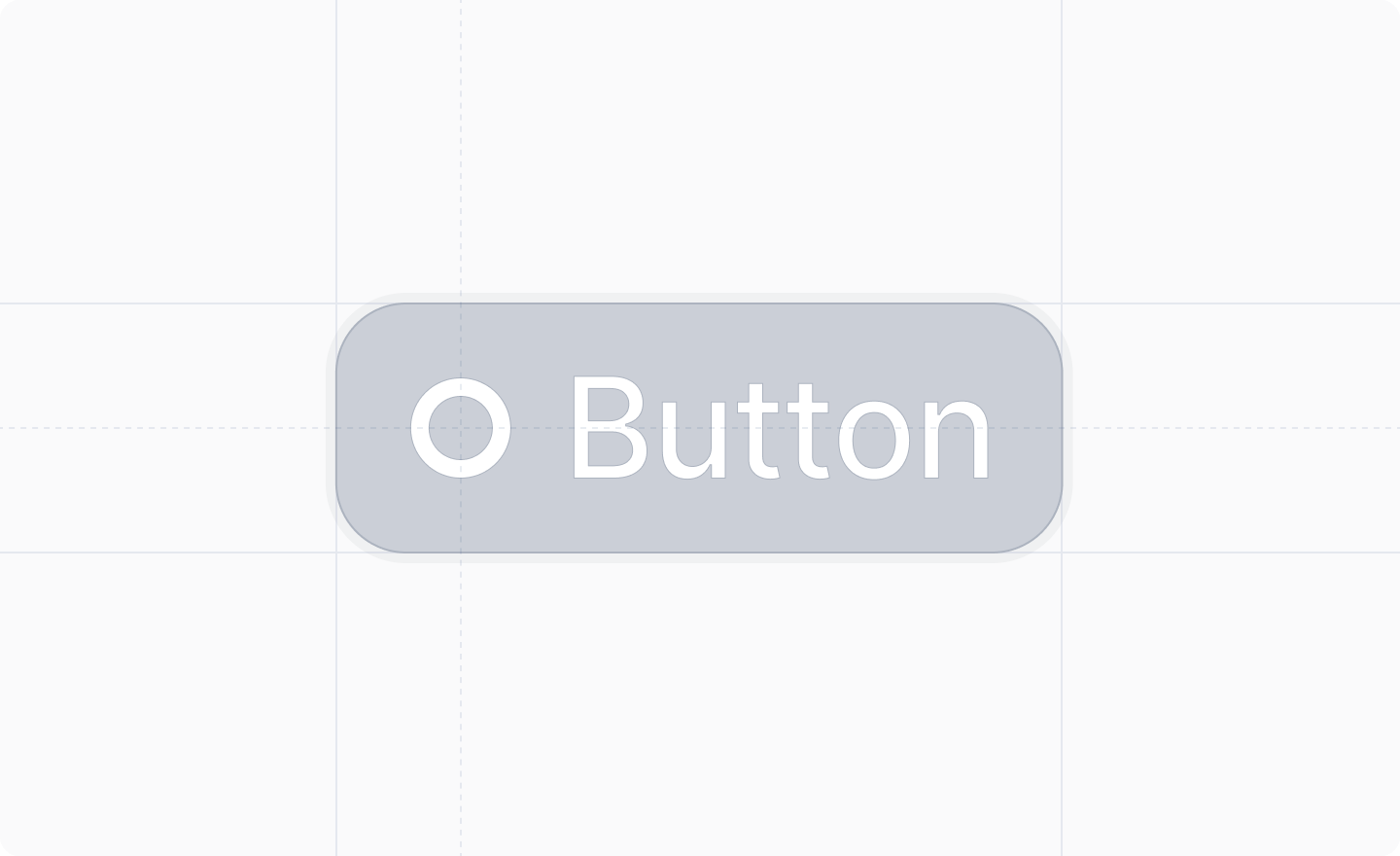
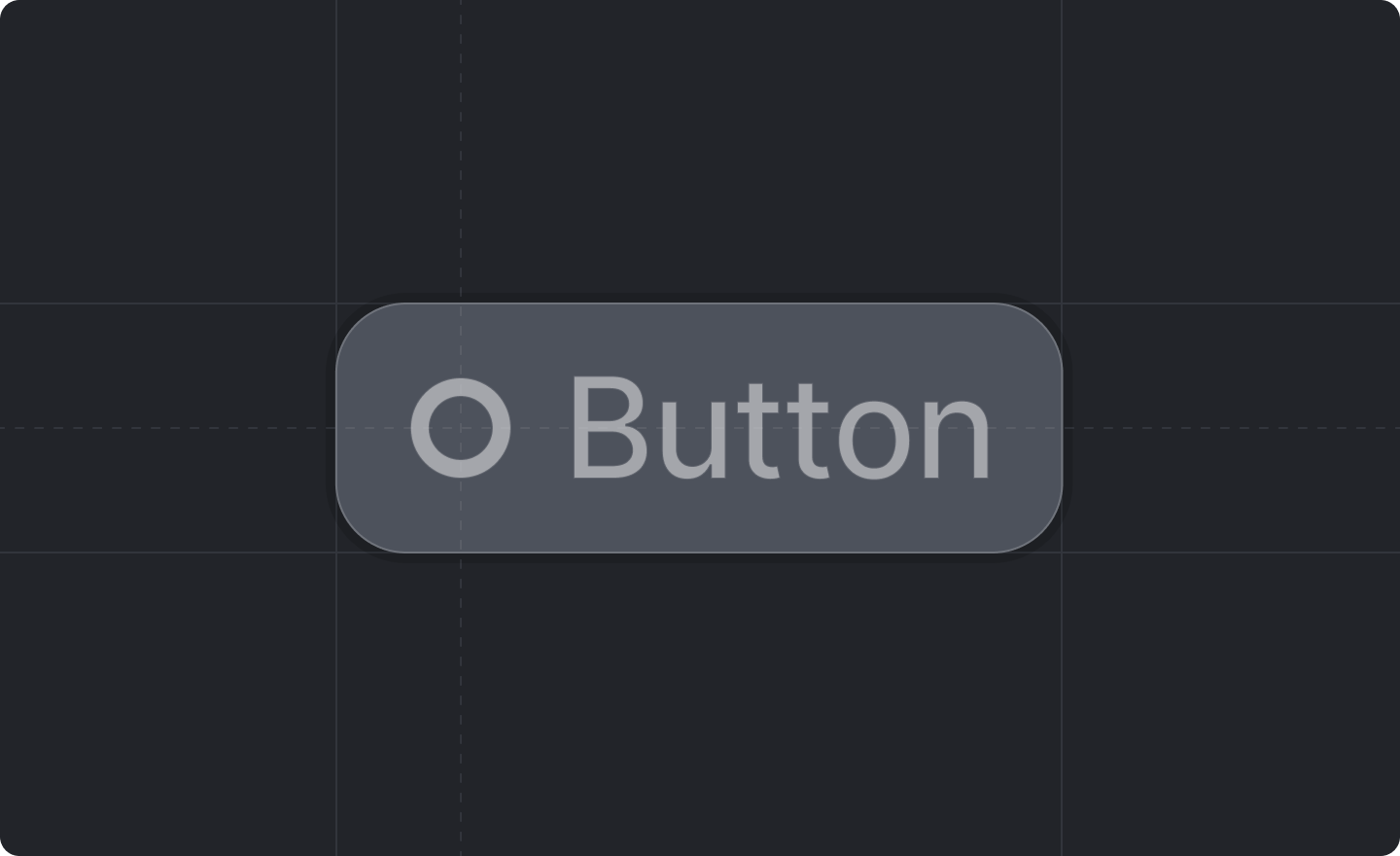
A button component.


Any buttons placed inside a dialog will be rendered at the bottom of the dialog.
Props
label : string
The text of the button.
variant? : "secondary" | "destructive"
The style of the button.
Defaults to "secondary"
.
The only way to have a “primary” button is to use a submit button.
onClick : () => void
A function that will be called if the users clicks the button.
disabled? : boolean
Whether or not the button is disabled.
Defaults to false
.
keyboardHint? : KeyboardKey
An optional keyboard shortcut that will fire the button.
Was this page helpful?