The Table API is experimental and may change in the future. It has been marked as @deprecated to remind the developer that it is experimental. It is not "deprecated", just experimental. Please don't use it in production versions of your app. We do not guarantee backward compatibility, or that the API will remain stable.
import {Experimental_Table} from "attio/client"
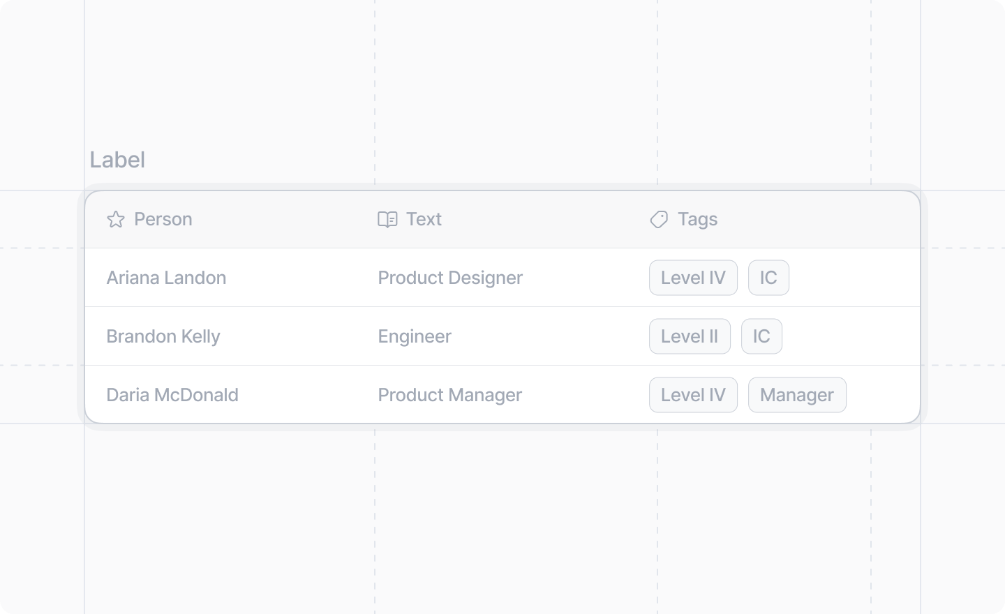
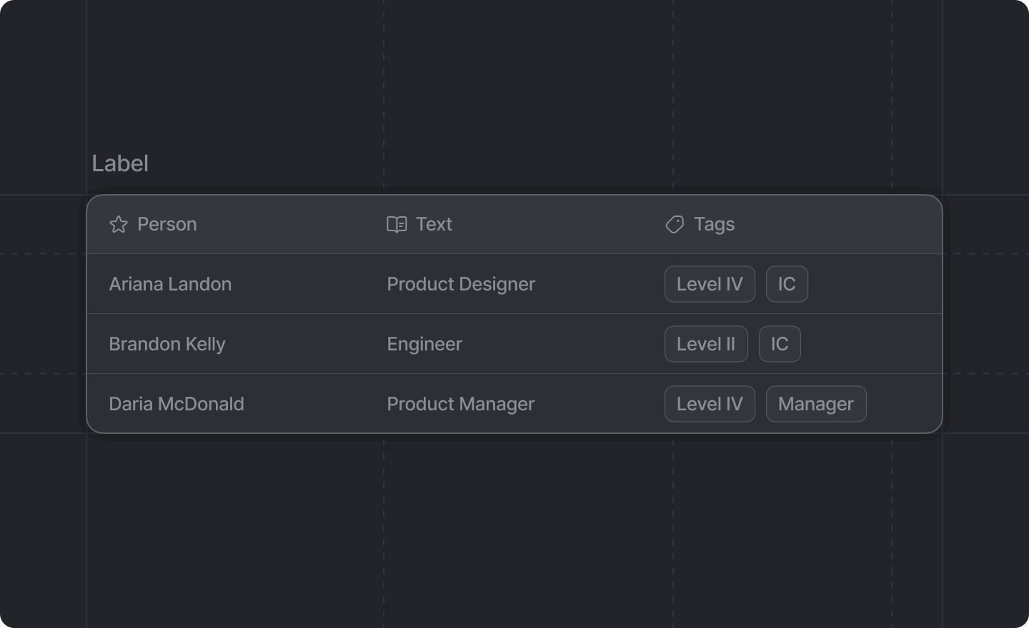
The Table component provides a structured way to display data in rows and columns. It supports headers with optional icons, and cells can contain text, links, badges, or avatars.

Example

TypeScript
import {Experimental_Table as Table, Link} from "attio/client"

export function MyDialog() {
  return (
    <Table label="Team Members">
      <Table.Header>
        <Table.HeaderCell icon="user">Name</Table.HeaderCell>
        <Table.HeaderCell icon="image">Avatar</Table.HeaderCell>
        <Table.HeaderCell icon="envelope">Portfolio</Table.HeaderCell>
        <Table.HeaderCell>Role</Table.HeaderCell>
        <Table.HeaderCell>Status</Table.HeaderCell>
      </Table.Header>
      <Table.Body>
        <Table.Row>
          <Table.Cell>John Doe</Table.Cell>
          <Table.Cell>
            <Table.Cell.Avatar name="John Doe" src="https://example.com/avatar.jpg" />
          </Table.Cell>
          <Table.Cell>
            <Link href="https://example.com">John's Portfolio</Link>
          </Table.Cell>
          <Table.Cell>
            <Table.Cell.Badge color="blue">Admin</Table.Cell.Badge>
          </Table.Cell>
          <Table.Cell>
            <Table.Cell.Badge color="green">Active</Table.Cell.Badge>
          </Table.Cell>
        </Table.Row>
        <Table.Row>
          <Table.Cell>Jane Smith</Table.Cell>
          <Table.Cell>
            <Table.Cell.Avatar name="Jane Smith" src={null} />
          </Table.Cell>
          <Table.Cell>
            <Link href="https://example.com/jane">Jane's Portfolio</Link>
          </Table.Cell>
          <Table.Cell>
            <Table.Cell.Badge color="purple">Developer</Table.Cell.Badge>
          </Table.Cell>
          <Table.Cell>
            <Table.Cell.Badge color="green">Active</Table.Cell.Badge>
          </Table.Cell>
        </Table.Row>
      </Table.Body>
    </Table>
  )
}

Props

label
string
An optional label to display above the table.
children
React.ReactNode
required
The table structure. Must contain exactly one <Experimental_Table.Header /> and one <Experimental_Table.Body />.
A <Experimental_Table /> component must have exactly one <Experimental_Table.Header /> followed by exactly one <Experimental_Table.Body /> as children.

<Experimental_Table.Header />

The header row of the table. Contains the column headers.

Props

children
React.ReactNode
required
The header cells to display.
A <Experimental_Table.Header /> component can only have <Experimental_Table.HeaderCell />s as children.

<Experimental_Table.HeaderCell />

A single header cell in the table header.

Props

icon
Icon
An optional Attio Icon to display next to the header text.
children
string
required
The text content of the header cell.

<Experimental_Table.Body />

The body of the table containing all data rows.

Props

children
React.ReactNode
required
The table rows.
A <Experimental_Table.Body /> component can only have <Experimental_Table.Row />s as children.

<Experimental_Table.Row />

A single data row in the table body.

Props

children
React.ReactNode
required
The table cells for this row.
Each <Experimental_Table.Row /> must contain the same number of <Experimental_Table.Cell /> components as there are <Experimental_Table.HeaderCell /> components in the header.

<Experimental_Table.Cell />

A single data cell in a table row. Can contain text, links, badges, or avatars.

Props

children
React.ReactNode
required
The content of the table cell. Can be: - Plain text - Text with <Link /> components - One or more <Experimental_Table.Cell.Badge /> components (if using badges, the cell must only contain badges) - One or more <Experimental_Table.Cell.Avatar /> components (if using avatars, the cell must only contain avatars)

<Experimental_Table.Cell.Badge />

A badge component for use inside a table cell. Useful for displaying status indicators or categories.

Props

children
string
required
The text content of the badge. Only text children are allowed.
color
'amber' | 'blue' | 'cyan' | 'green' | 'grey' | 'lavender' | 'lime' | 'orange' | 'pink' | 'purple' | 'red' | 'yellow'
required
The color of the badge.

<Experimental_Table.Cell.Avatar />

An avatar component for use inside a table cell. Useful for displaying profile pictures or organization logos.

Props

name
string
required
The name of the person or entity represented by the avatar. This is used for accessibility and as a fallback when no image is provided.
src
string | null | undefined
required
The URL of the avatar image. If null or undefined, a fallback representation based on the name will be displayed.