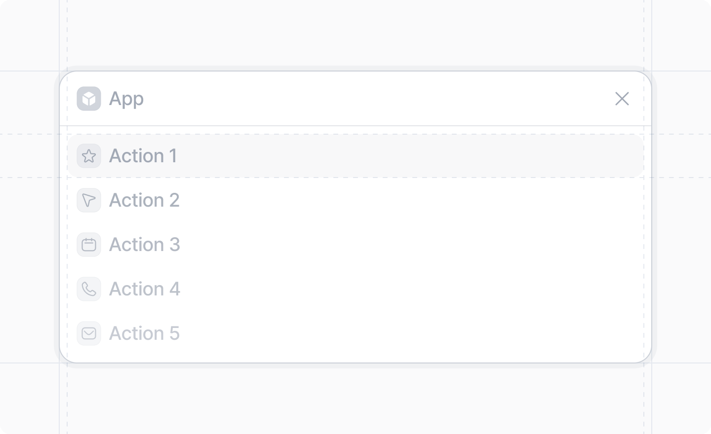
The DialogList API is experimental and may change in the future. It has been marked as @deprecated to remind the developer that it is experimental. It is not "deprecated", just experimental. Please don't use it in production versions of your app. We do not guarantee backward compatibility, or that the API will remain stable.

Example

import {DialogList, showDialog, StatusBadge} from "attio/client"

showDialog({
    title: "My Items",
    Dialog: () => {
        return (
            <DialogList emptyState={{text: "No items found"}}>
                {items.map((item) => (
                    <DialogList.Item
                        key={item.id}
                        icon="Note"
                        onTrigger={() => {
                            window.open(item.url)
                        }}
                        actionLabel="View item"
                        suffix={<StatusBadge color="#00D17E">{item.status}</StatusBadge>}
                    >
                        {item.name}
                    </DialogList.Item>

                ))}
            </DialogList>
        )
    },
})

DialogList Props

emptyState
{text:string, actions: Array<{label:string, onTrigger:() => void, icon?: Icon}>}
required
The text to display when the list is empty, and an optional array of actions to display when the user clicks the empty state.
children
React.ReactNode
required
The children should be a list of DialogList.Item components.

DialogList.Item Props

children
React.ReactNode
required
The text to display for the item.
icon
Icon
required
The icon to display for the item.
onTrigger
() => void
A function that will be called if the user clicks the item.
actionLabel
string
The text to display for the action button for the item in the dialog footer. Required if onTrigger is provided.
suffix
React.ReactNode
The suffix to display for the item. Can be a Typography component or a StatusBadge component.