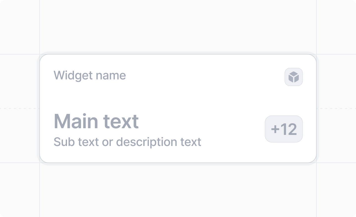
The Widget API is experimental and may change in the future. It has been marked as @deprecated to remind the developer that it is experimental. It is not “deprecated”, just experimental. Please don’t use it in production versions of your app. We do not guarantee backward compatibility, or that the API will remain stable.
import {Widget} from "attio/client"

Props

onTrigger
() => void
An optional function that will be called when a user clicks on the widget.
children
React.ReactNode
required
A text widget can have – at least one – of the following children:Not all of them are required.
If you do not provide a <Widget.Title /> your app’s name will be used.
At least one text component is required for the badge to be displayed.

Example

<Widget.TextWidget
  onTrigger={() => {
    // do something
  }
}>
  <Widget.Title>Title</Widget.Title>
  <Widget.Text.Primary>Main text</Widget.Text.Primary>
  <Widget.Text.Secondary>Description text</Widget.Text.Secondary>
  <Widget.Badge text="42" color="blue" />
/>