This component is returned by useForm().
The RadioGroup API is experimental and may change in the future. It has been marked as @deprecated to remind the developer that it is experimental. It is not "deprecated", just experimental. Please don't use it in production versions of your app. We do not guarantee backward compatibility, or that the API will remain stable.

Example

radio-group-dialog.tsx
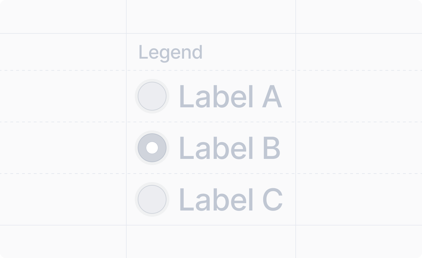
import React from "react"
import {Forms, useForm, showToast} from "attio/client"

export function RadioGroupDialog() {
  const {Form, SubmitButton, RadioGroup} = useForm(
    {
      department: Forms.string(),
    },
    {
      department: "engineering",
    }
  )
  return (
    <Form
      onSubmit={async (values) => {
        await showToast({
          title: "Form submitted",
          variant: "success",
          text: `Selected department: ${values.department}`,
        })
      }}
    >
      <RadioGroup name="department">
        <RadioGroup.Item value="engineering" label="Engineering" />
        <RadioGroup.Item value="sales" label="Sales" />
        <RadioGroup.Item value="marketing" label="Marketing" />
        <RadioGroup.Item value="support" label="Support" />
      </RadioGroup>
      <SubmitButton label="Submit" />
    </Form>
  )
}

Adding a legend

To add a legend to your radio group, wrap it in a <Fieldset />:
<Fieldset legend="Department">
  <RadioGroup name="department">
    <RadioGroup.Item value="engineering" label="Engineering" />
    <RadioGroup.Item value="sales" label="Sales" />
  </RadioGroup>
</Fieldset>

Props

name
string
required
The path to the string value of the radio group field in your form schema.e.g. "department", "shipping.method"
disabled
boolean
Whether or not the radio group should be disabled.Defaults to false (not disabled).
children
React.ReactNode
required
The <RadioGroup.Item />s representing the available options.
A <RadioGroup /> component should only have <RadioGroup.Item />s as children.

<RadioGroup.Item />

A radio group item representing a single selectable option.

Props

value
string
required
The value of the radio item that will be stored in the form when selected.
label
string
required
The label displayed next to the radio item.