

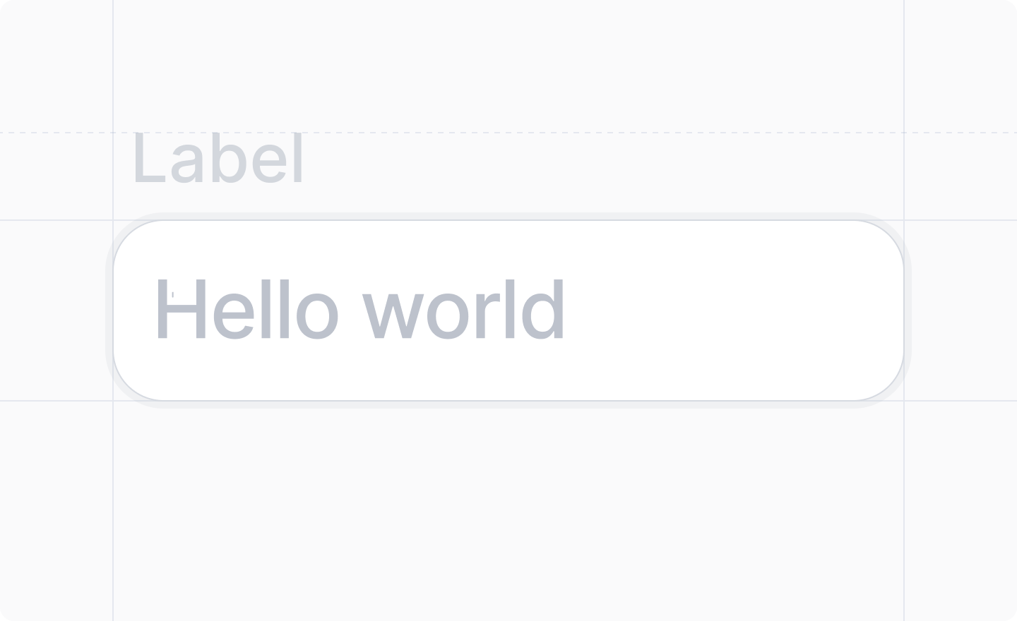
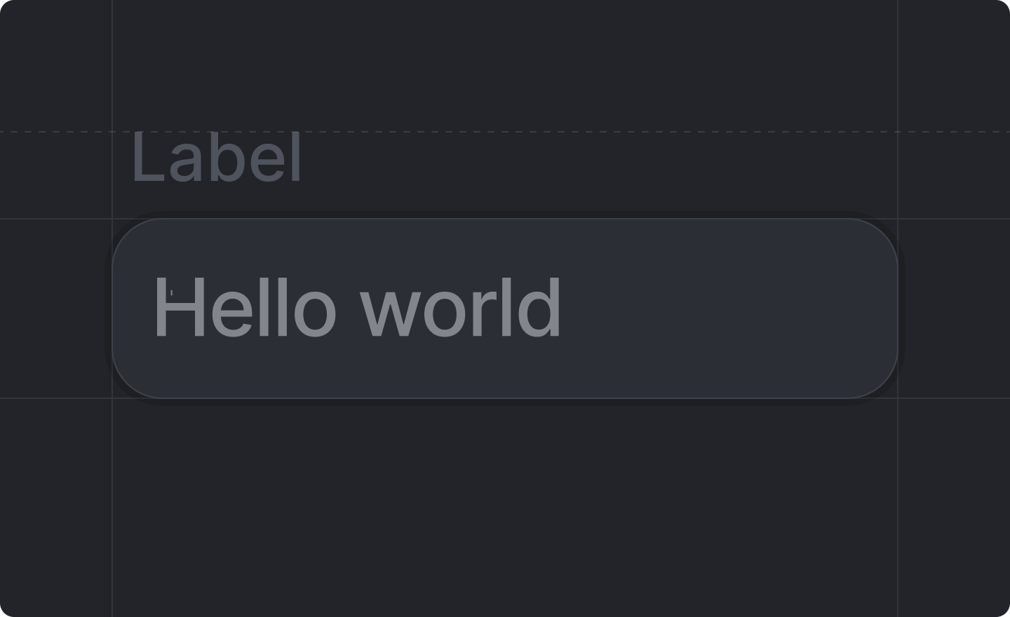
This component is returned by
useForm().<TextInput /> for single-line string fields. For multi-line text (e.g. descriptions, notes, or comments), use <TextArea /> instead. The component binds to a string field in your form schema.
Example
form-text-input-dialog.tsx
Props
string
required
The label of the input field.
string
required
The path to the
string value of the input field in your form schema.e.g. "name", "shipping.address.street"'text' | 'email' | 'password' | 'tel' | 'url'
string
An optional placeholder text for your input.
boolean
Whether or not the field should be disabled.Defaults to
false (not disabled).