

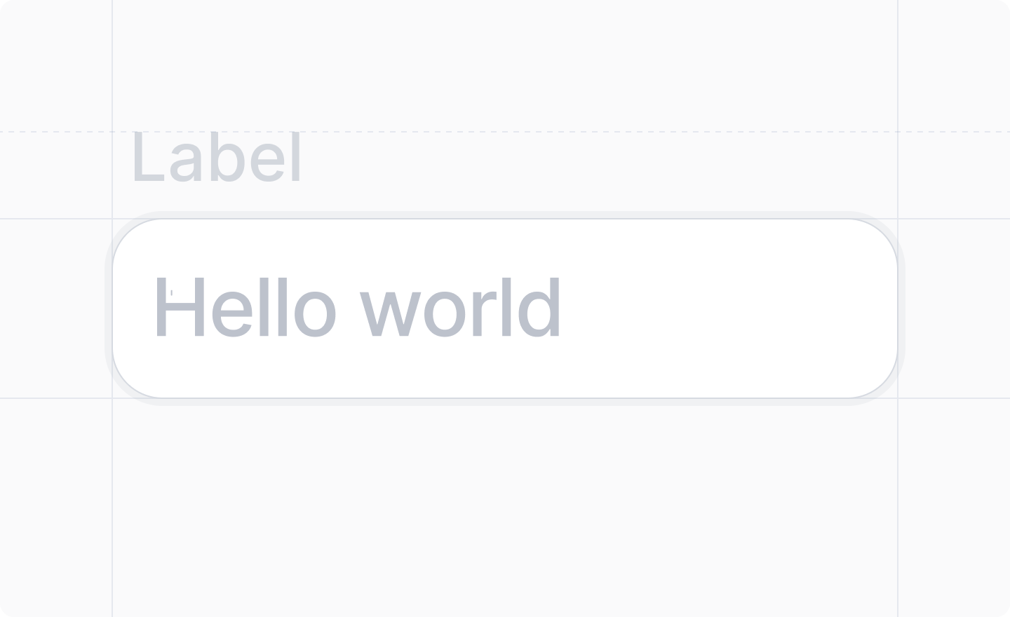
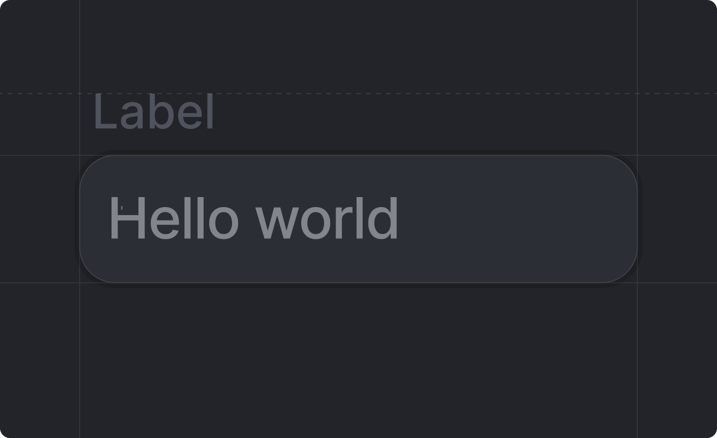
This component is returned by
Settings.useForm().useForm() where validation is defined in the schema, workspace settings validation is specified directly on the input components using props like minLength, maxLength, multiline, and url.
Example
src/app/settings/page.tsx
Props
string
required
The label of the input field.
string
required
The key of the
string value of the input field in your settings schema.e.g. "display_name"'text' | 'email' | 'password' | 'tel' | 'url'
string
An optional placeholder text for your input.
number
The minimum length (number of characters) required. Validation will fail if the user inputs a
string shorter than this value.
number
The maximum length (number of characters) allowed. Validation will fail if the user inputs a
string longer than this value.
boolean
If true, the input will be rendered as a multiline textarea instead of a single-line input.Defaults to
false.boolean | { protocol?: RegExp; message?: string }
If true, validates that the string is a valid URL with an allowed protocol (default http/https) and a valid top-level domain.You can pass an object with
protocol to override the allowed protocol pattern, and message to customize the validation error message.Defaults to false.boolean
Whether or not the field should be disabled.Defaults to
false (not disabled).